
Let’s make your idea happen:
Helping Kemira make a force that’s invisible to most, more tangible and concrete.
Big corporations, and industrials in particular, seem to lose sight of their contributions to everyday life. “Work” turns into a formula of raw material sourcing, balance sheets, shipping products and reporting quarterly results.
Kemira’s true purpose must be about more than providing chemicals, which they do both efficiently and sustainably. The company’s purpose of Adding to your everyday was born by digging deep into the tangible value Kemira creates for people, businesses and society.
Crystallising the promise
The company’s key strength lies in its people. Humans of Kemira is a storytelling concept created to both shine a light on the company’s key differentiator, and communicate the new brand promise: Kemira is the first choice in water chemistry, and its people are driven to preserve and protect the world’s resources through their better chemistry.
“We were looking for a partner to refresh our brand, and Motley came in as the dark horse and helped us do that through a digital and human-centric approach.”
Marjo Vänttinen, Global Manager, Kemira


Positioning for purpose
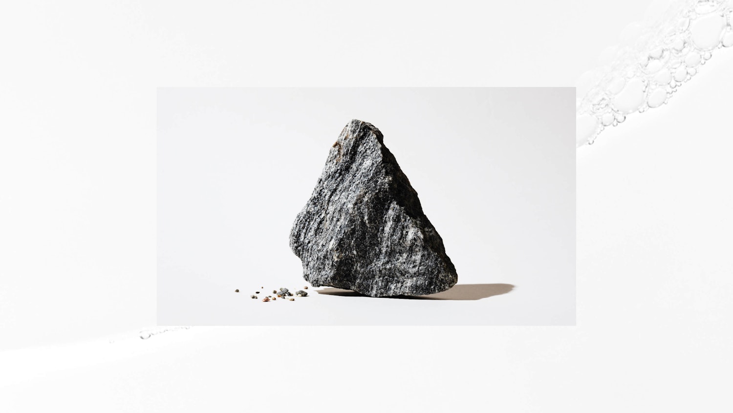
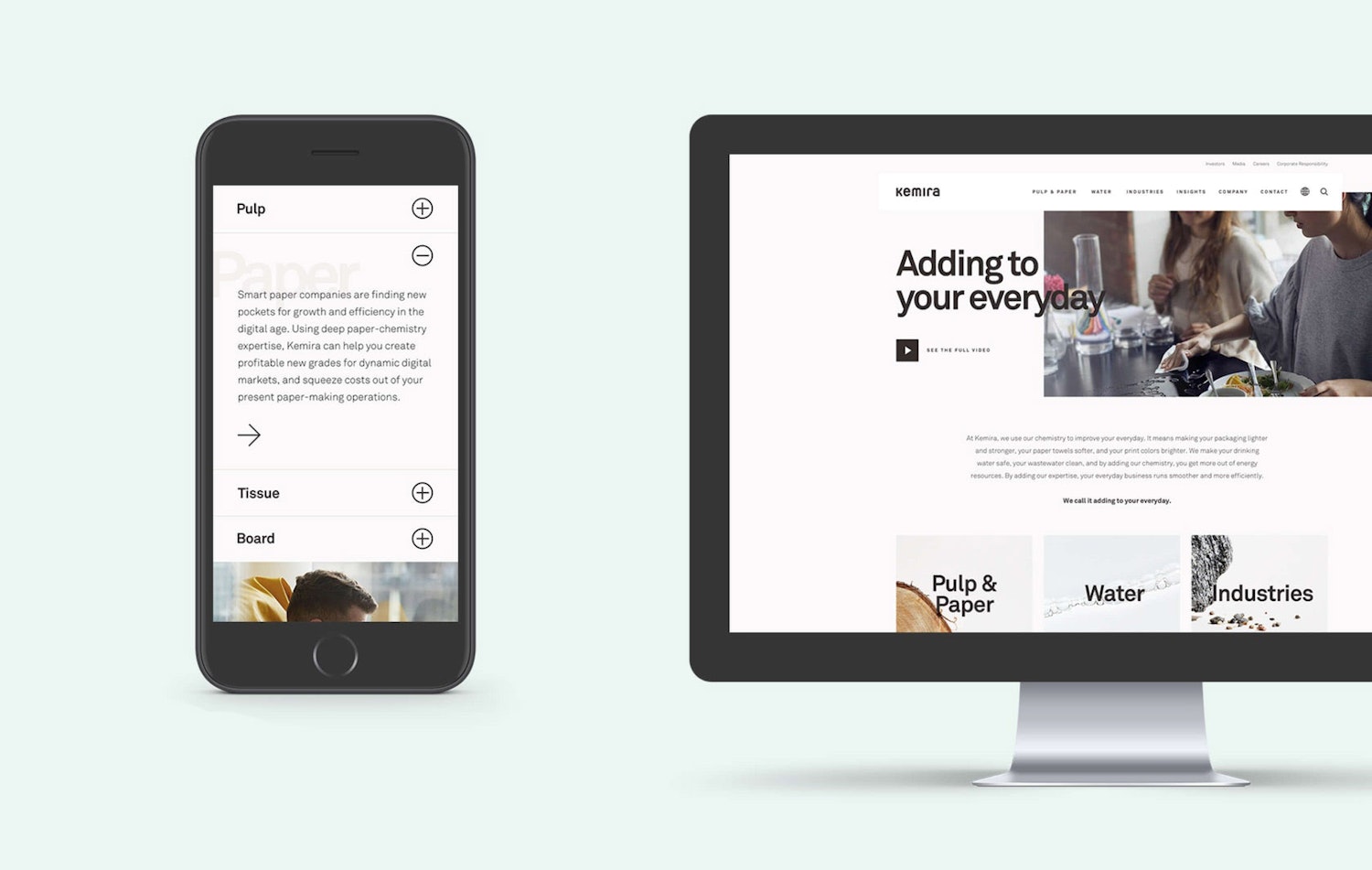
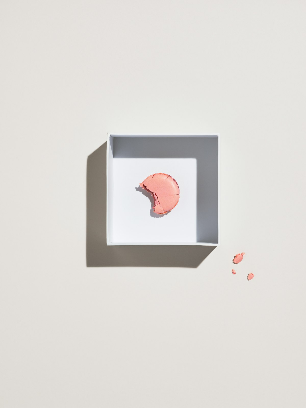
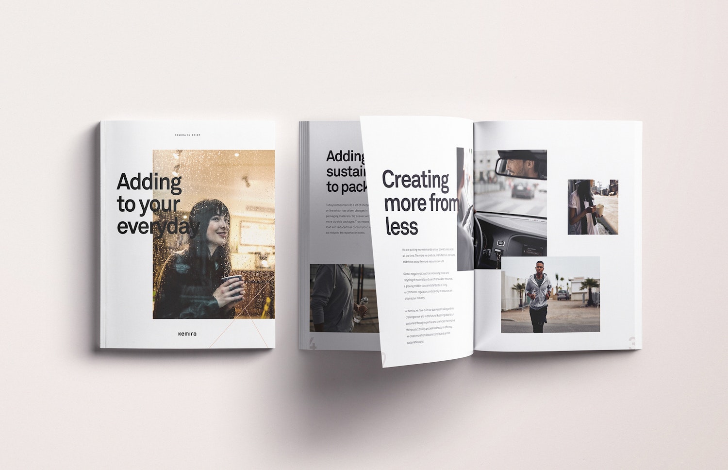
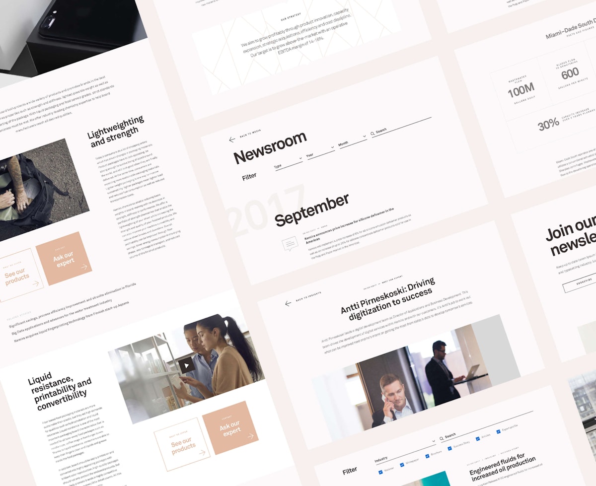
As Adding to your everyday became the red thread of the new brand, we began prototyping a clean, soft and transparent visuality in line with the new purpose. By positioning Kemira from a background player in a complex value chain, to a key enabler of our lifestyles, we aimed to make the company’s role in the world more tangible.

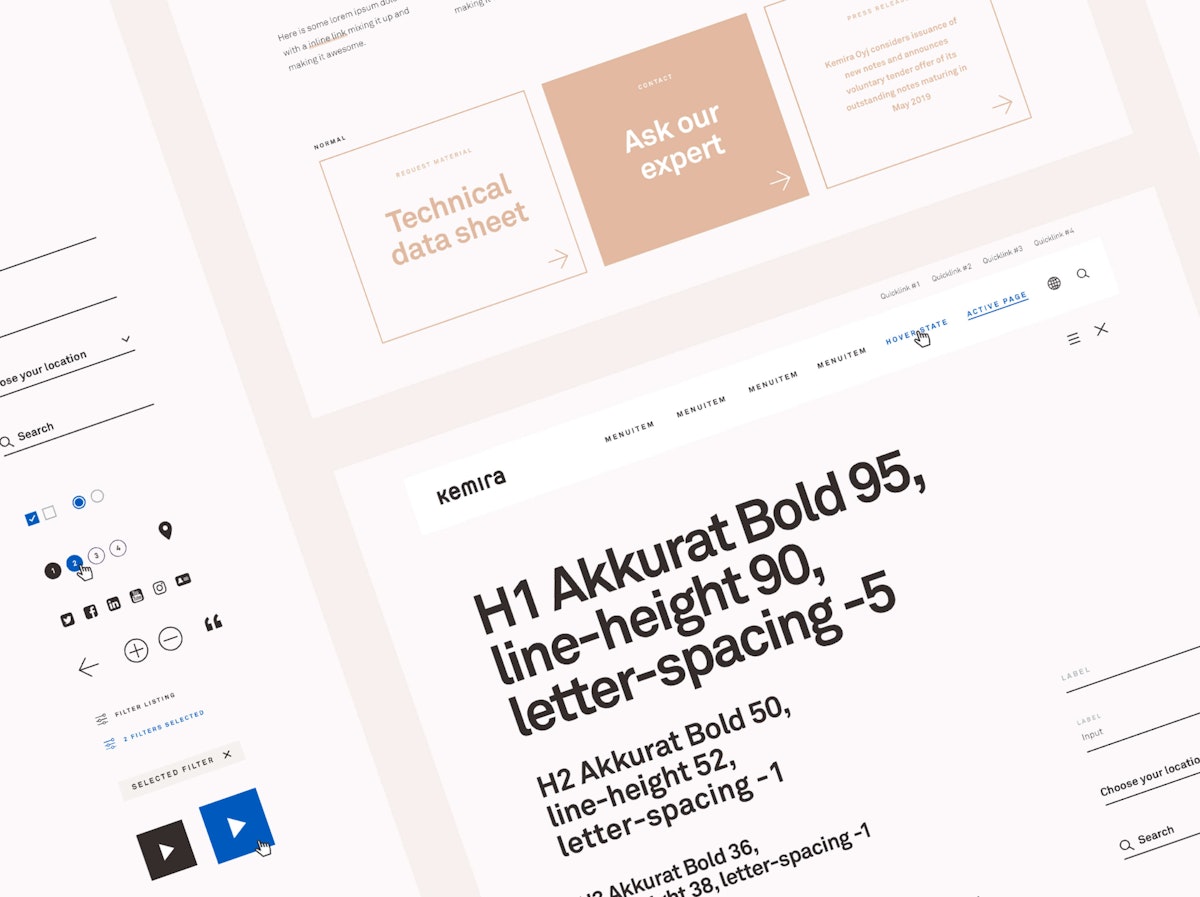
The design language ensures a consistent brand experience through patterns and UX principles. By refining the kemira.com information architecture, the site now allows for more engage content. We also created kemira.design, an online style guide and brand book to ensure consistency and ease of use.
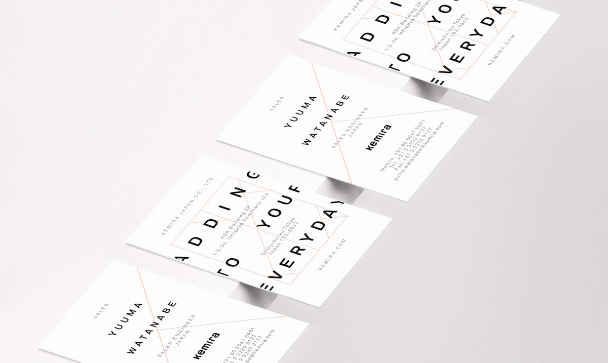
The existing logo and typeface remained, we merely made them bolder yet simultaneously subtle. An authoritative but friendly voice and aesthetic was born.
The imagery aims to communicate the magic Kemira creates for consumers, as well as focusing on the people making that magic happen. The colour palette was refreshed, giving it more contrast and making touchpoints pop.

“In a global company, the design tool helps us keep the brand aligned, communicate its principles, document through design language and develop the brand further. The tool also helps communicate Kemira’s brand foundation and get all our employees on board.”
Marjo Vänttinen, Global Manager, Kemira